US Space Force logo may look like a Star Trek rip-off, but only if you miss the obvious ‘RUSSIAN connection’
Published 25 Jan, 2020 01:22 | Updated 25 Jan, 2020 05:44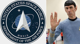
With the launch of a new logo for the US Space Force, cadets might think they’ve signed up to serve the Federation of Planets of Star Trek lore, but internet sleuths have uncovered another hidden connection – to Moscow, of course.
President Donald Trump rolled out the fresh logo in a tweet on Friday, immediately triggering comparisons to the iconic sci-fi series and its fictional space force, Starfleet. The similarities were hard to miss.
Only a teensy trademark violation. No biggie
— Vote blue, all the way through (@kid_prairie) January 24, 2020
“Sure the Space Force and Star Trek have the same logo but everyone knows Star Trek has all sorts of time travel going on,” one user said, providing some plausible deniability. “Obviously they went back in time and stole it. That's why Trump is suing Captain Kirk.”
George Takei – who played Mr Sulu in the original Star Trek series in the 1960s, now a vocal critic of the president – also weighed in, chastising the copycats behind the new logo.
There is nothing sacred any more. pic.twitter.com/ubyy4OIZrp
— George Takei (@GeorgeTakei) January 24, 2020
All Star Trek actors automatically become officers. Your intimate knowledge of the Borg will help prevent assimilation-one of Space Force's biggest threats 😀🙃🖖
— Mcgerk_fish65 (@Fish65Mcgerk) January 25, 2020
With all eyes on Starfleet, however, some netizens dug a layer deeper and discovered another possible inspiration for the new symbol, albeit a non-fictional one.
While everyone’s busy comparing the #SpaceForce logo to the #StarTrek Federation logo, I’m just gonna drop the Russian Space Force logo right here and let y’all decide who wore it better. pic.twitter.com/6o0nvSmW5x
— ClevelandBhoy (@Choops34) January 24, 2020
“Actually has anyone compared the US Space Force logo with the Russian Space Force logo? They both have that pointy spaceship thing in the middle,” one user observed.
Also, here are some logos for the Russian Space Force pic.twitter.com/QpmqCIrxg0
— Rob ☃️ Graham (@ErrataRob) January 25, 2020
Amid the frenzy of comparisons, another commenter urged calm, pointing out that a similar “pointy spaceship thing” has been used in various iterations in logos for space agencies around the world, including NASA.
Everyone is pointing fingers at trump for the space force logo and it's similarities to star trek.. and nobody realizes that an indented triangle and a circle have a looong history in space agencies. see: usa, russia, china.calm your collective mammaries. pic.twitter.com/b57zupPRuC
— Abstürzender Altgarg (@flatterkatz) January 24, 2020
I take it a lot of people have never seen the logos for Russia's @roscosmos & India's space agency. #SpaceForcepic.twitter.com/QFMqw6jw6v
— Matthew Balan ن (@MatthewJLB) January 24, 2020
The new logo is not the first time Space Force has drawn mockery on the internet. After introducing its new uniform last week – featuring a green woodland camouflage pattern – it wasn’t long before the jokes started flying, with many wondering how forest camo would conceal America’s new astro-troopers against the black expanse of space. However on that count, instead of taking another note from Starfleet, with its fluorescent uniforms, it might be prudent to return to the drawing board.
The US Government announced the “new” #SpaceForce logo.Here is the leaked uniform.#StarTrekpic.twitter.com/hVK6nYz2nH
— Paul Almeida (@AzorcanGlobal) January 25, 2020
This one's just to Madden more people. pic.twitter.com/ePDdtQlLRn
— Jasoπ Rodgër 🇨🇦🇩🇪🇳🇱 (@teacherjake) January 24, 2020
Like this story? Share it with a friend!