Xiaomi mocked online after spending 3 years on new logo that looks almost identical to the original
Published 2 Apr, 2021 07:54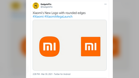
Chinese smartphone-maker Xiaomi was ridiculed online after it unveiled a new version of its company logo, which surprisingly looks almost identical to the old one.
The revamped logo that was unveiled this week looks like a slightly rounded version of the previous logo. The colors have remained the same – orange and white.
A Logo That Feels "Alive"#InnovationForEveryonepic.twitter.com/oimhPHZohK
— Xiaomi (@Xiaomi) March 30, 2021
Chinese social media users were baffled at how little was changed, considering that the redesign took three years to develop and reportedly cost two million yuan ($305,000). Many joked that the company’s co-founder and CEO Lei Jun “got scammed” and should “call the police.” Others claimed that they could have come up with a new logo for a much cheaper price.
The South China Morning Post (SCMP) quoted a person writing online as saying “I can do this for 20,000 yuan,” and another adding “Or 2,000.”
English-speakers did not seem impressed either, arguing on social media that the old and the new logos were almost identical. “Haha spot the difference,” one person wrote, while others called the redesign “a joke” and poked fun at the hashtag #InnovationForEveryone, which Xiaomi used to promote the new logo.
Same logo.. Just rounded corners. That's not a new logo
— Nelly Mchoraji (@MusiomiArt) March 30, 2021
“I could have made that for half the price the designer did[,] it’s nothing new,” one user wrote in English.
Japanese graphic designer Kenya Hara, who created the new logo, called it “a perfect balance between a square and a circle,” that captures Xiaomi’s “inner spirit.” He said the design was inspired by geometry and mathematics.
Let's hear from @haraken_tokyo and the story behind our new logo design. #XiaomiMegaLaunchpic.twitter.com/FGkXJXM1nK
— Xiaomi (@Xiaomi) March 30, 2021
Lei acknowledged that some might be “disappointed” by the change. “I suppose many people would say, ‘That’s it? That took three years?’” he wrote in a post on Chinese social media platform Weibo, according to SCMP. He argued that the redesign represents an upgrade of the company’s “internal spirit and qualities.”
"To be honest, I didn't get it at the first sight, but I've grown to like it a lot. It's the best representation of today's Xiaomi," Lei wrote on Twitter.
Also on rt.com US judge temporarily removes China’s Xiaomi from Trump-era blacklistThink your friends would be interested? Share this story!