Russian Railways picks new logo
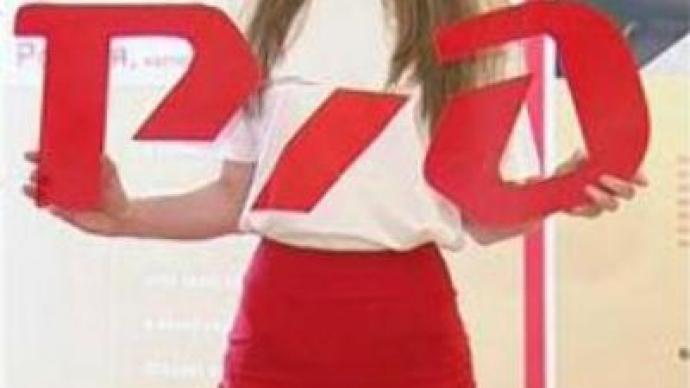
Russian Railways unveiled its new corporate logo on Thursday at the second annual Rail-Business Forum in the resort city of Sochi. It’s the start of a rebranding process that could cost the company up to $ US 150 MLN.
Over the last few years, the Russian Railways stock company has been restructured in response to rising demand for transport services in Russia.Now, the company has picked a new corporate outfit to match its new outlook. Russian Railways President Vladimir Yakunin says the new brand will help attract both passengers and investors, but it is difficult to estimate what the returns will be.“This is a very difficult area to predict financial return. That’s because it is not easy to estimate the value of rebranding, and the quality of the services, for example, the appearance of the conductor, and how it all works together,” he says. Russian Railways accounts for 39 % of the country’s total freight turnover and 41 % of its passenger turnover. While known mainly for its rail transport, the company has branched out into other sectors of the economy including tourism, construction, and telecoms. The company’s new logo is believed to embody all these new aspects of development.The bright red color is meant to represent the company’s aggressive approach and willingness to change. The sign also displays the Cyrillic abbreviation of Russian Railways, pointing to the Russian origin of the company.Meanwhile, Russian Railways is not the first state company to rebrand. In 2001, Aeroflot changed its corporate style in a commercial campaign that cost the company a total of $ US 8 MLN.Transport Analyst Evgeny Badalov says, “There is a very successful example of Aeroflot that not only changed its image, all the interiors and the exteriors of the aircraft, but also it coupled it with the significant changes in the business processes: how they treat customers, how they manage people who interact with customers.” In the second stage of its rebranding, Russian Railways will pick its corporate colours, which will provide the uniforms for 1.3 million staff as well as a new-look for the carriages.According to BBDO Branding – the company hired for re-styling – the entire process will take no more than two years. By then, representatives hope the company will have undergone a complete makeover both on the outside and the inside.
You can share this story on social media:


